A few months ago, Philippe Bernard, a post-doc in our lab, conducted a study examining whether exposure to sexualized music videos (pretty much a norm in this artistic genre) influences attitudes towards sexual harassment (they do). One of the secondary points of the study concerned another variable: self-objectification, a term that captures people's tendency to consider their own body through the prism of a third person's eyes, to "see themselves as an object". We hypothesized that people who self-objectify may be more lenient towards sexual harassment (which in, a way, involves treating others like objects as well). We administered questionnaires evaluating self-objectification and tolerance towards sexual harassment on numeric scales (as is customary in social psychology) and analyzed the results in our paper, that we submitted to a scientific journal. A few months later, we received a feedback from this journal, including one from a reviewer, who wrote the following (don't worry if it seems a bit arcane):
"I did not follow the statement on p. 13 that there was a correlation between SO and sexual harassment r = .18, p = .01, but that this tendency was stronger among male, r..28, p = .002 and female r=.31, p = .002 participants. Doesn't the r value = .18 and p value = .01 derive from the combined correlation for men and women? How does this get stronger for men and women when considered separately? Please clarify."
In plain English, this means: How can there be a stronger relation between self-objectification and attitudes towards sexual harassment when considering each sex separately than when lumping them together? Intuitively, shouldn't the relation between the two variables remain as strong or become stronger when the two groups are aggregated?
Our first reaction in reading this was to make sure there was no error in our data. There wasn't. So, now, grab an hourglass and pause a minute to answer the following question: How is this possible?
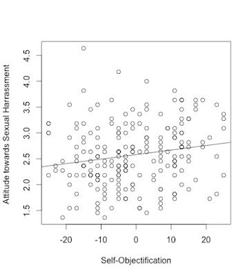
Figured it out? Well, if you have, you can probably stop here. If not, look at the following graph. This is a scatterplot representing self-objectification on the X axis and attitudes towards sexual harassment on the Y axis (with more positive scores indicating greater tolerance). Each bullet represents a person in our sample. As you can see, bullets are scattered (almost) all over the square, suggesting that there is little relation between self-objectification and attitudes towards sexual harassment: For example, some people who self-objectify a lot have negative attitudes, whereas almost as many have positive attitudes.
If we try to draw a line (called a "regression" line) representing this relation, here is how it looks:
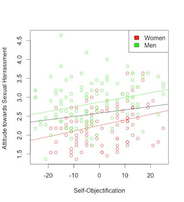
The line is barely going upwards suggesting that there is a weak positive relation between self-objectification and attitudes towards sexual harassment. This is consistent with the reviewer's comment. Now, what happens when we consider men and women separately? To find this out, I colored bullets representing women in red and those representing men in green:
As you can see from this plot, women in our sample tend to have more negative attitudes towards sexual harassment than men (that's not very surprising): Indeed the green points are almost systematically above the red points. Now, if you focus only on the red points, notice that the relation between self-objectification and attitudes towards sexual harassment becomes much stronger. Consider for example the women with highest scores on sexual harassment. These women score relatively high on self-objectification. By contrast, those with the lowest self-objectification score tend to score lower on sexual harassment compared to other women. If you look at men separately, the same observation holds. This is confirmed when drawing the lines for the two subgroups separately;
As you can see the "slope" of these new lines is much steeper than the slope of the old line. This shows that, when considering each sex separately, the relation between the two variables is moderately strong. Basically, this relation was hidden when men and women were lumped together (do not interpret this statement as advocacy for sexual segregation). The difference between men and women in terms of tolerance towards sexual harassment led to assembling two relatively "slim" sets of bullets (the green and red ones) into a bulky cloud of bullets that could only be summarized by this quite flat black regression line. By ignoring sex (or I should say "gender" but then the title of this post would be much blander), we understated how much we knew about someone's tolerance towards sexual harassment when informed of their level of self-objectification. Thus rather than confirming the relation observed in each subgroup, this relation was diluted when both sexes were assembled.
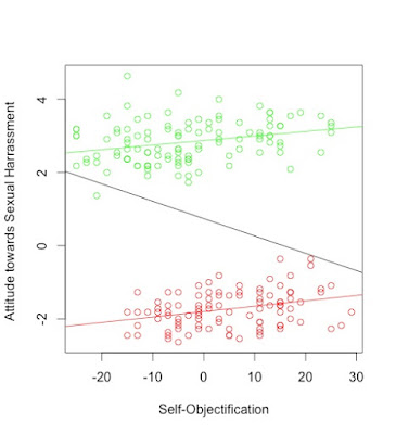
This is intriguing. Let's now play with the data to push this paradox even further. What would happen, say, if women self-objectified massively more than they do (we know that women tend to self-objectify more than men) and that they were even less tolerant towards sexual harassment but that men stayed at exactly the same place? If this was the case, the red points should be shifted on the right. But, this shouldn't affect the relation between self-objectification and sexual harassment WITHIN each group. Here is the resulting plot (if I attribute every women in the sample a "bonus" of 3 points of self-objectification and a penalty of 4 points for "attitudes towards sexual harassment"):
As you can see, the slope of the lines within each group remains the same. But an important change has occurred when considering the whole dataset: Now that the women's cloud has shifted to the right and downwards, ignoring sex leads to an overall tendency for people with high self-objectification to be less tolerant towards sexual harassment. In other words, in the whole sample, the bullets with the higher scores on self-objectification (typically women) will tend to have lower scores on sexual harassment whereas those with the lowest scores on sexual objectification (typically men), tend to have the higher scores. This means that the regression line will now be negative. And it is:
The correlation coefficient for this altered dataset is now negative and of -.26 (indicating a negative relationship). Admittedly, this line is a bad fit to the data but is shows that ignoring a third variable can lead to very poor conclusions about the relationship between two variables: While the relation is actually positive within each group, we can mistake it for a negative one. Actually, this example is but an illustration of a paradox uncovered by statistician Edward H. Simpson in 1951 and eponymously named "Simpson's paradox".
It comes with a cautionary tale: Look at the data rather than focusing on coefficients and p values! When observing the diagram above, it is obvious that there is something wrong with the overall model. It seems self-evident that one should look at men and women separately. It is much less the case with a less extreme example. With the original data, we needed to color men and women in different hues to detect the issue. How did we know that the third variable was gender? Well... We didn't but there were compelling reasons to surmise that gender would be an important factor in this context and we decided to integrate it in the analysis. When embarking on data analysis, it's important to take into account the variables that may play such a role and could potentially dilute the relationship between our variables of interest. This can only be done "upstream" when designing the study and considering, usually on theoretical grounds, what these variables could be. Failure to do so may lead us to very poor interpretations of our data if Mr. Simpson's ghost has chosen to haunt them.
Postscripts:
* The following paper provides a detailed analysis of Simpsons' paradox in psychological science and a toolbox for detecting it.
* Note that in writing this, my intention was not to denigrate the reviewer. Actually, his/her comments made the paper stronger and helped us discover aspects of our data that we had not thought about. To dispel such a misunderstanding, I removed a link to the "Reviewer 2 must be stopped" facebook group.
Reference:
Simpson E. H. (1951). The interpretation of interaction in contingency tables. J. R. Stat. Soc. Ser. B13, 238–241
This post was written by Olivier Klein, who teaches social psychology at the Université Libre de Bruxelles, Belgium.


No comments:
Post a Comment